
Walk into a beautifully designed room and you’ll notice something interesting. It is rarely the furniture that grabs your attention first. It is the harmony. The colors feel connected. The atmosphere feels intentional. Nothing looks forced. Nothing feels out of place.
One of the biggest contributors to this visual harmony is the relationship between curtains and wall paint.
Unfortunately, many homeowners spend weeks choosing the perfect paint color, only to ruin the overall effect with poorly matched curtains. Others purchase expensive curtains that clash with their walls and wonder why the room still feels incomplete.
The truth is simple: even the most luxurious curtains can look ordinary when paired with the wrong wall color, while the right curtain and paint combination can make an average room look professionally designed.
So how do you achieve that seamless look?
Let’s explore the principles interior designers use when matching curtains with wall paint and how you can apply them in your own home.
Why Curtain and Wall Color Harmony Matters
Your walls occupy the largest visual space in a room. Curtains usually take up the second largest visual area. Because of this, these two elements naturally influence how the entire room feels.
When they work together, a room appears:
- Larger
- More elegant
- More balanced
- More expensive
- More inviting
When they clash, the room can feel chaotic, smaller, and visually uncomfortable.
Think of your walls and curtains as dance partners. One doesn’t need to overpower the other. They simply need to move together beautifully.
Rule 1: Decide Whether You Want Contrast or Harmony
Before choosing curtain colors, ask yourself a simple question:
Do I want my curtains to blend in or stand out?
Your answer determines everything.
For a Soft and Elegant Look
Choose curtains that are within the same color family as your walls.
For example:
- Cream walls + Beige curtains
- Light grey walls + Charcoal grey curtains
- Light blue walls + Navy blue curtains
This creates a layered and sophisticated appearance that feels calm and luxurious.
For a Bold and Dramatic Look
Use contrasting colors.
Examples include:
- White walls + Emerald green curtains
- Grey walls + Mustard curtains
- Beige walls + Deep navy curtains
The curtains become a focal point and immediately attract attention.
At Ceejay Interiors, many clients are surprised by how a carefully selected contrasting curtain can completely transform an ordinary room into a statement space.
Rule 2: Let Natural Light Guide Your Choice
Color behaves differently depending on light.
A curtain that looks stunning in a showroom may look completely different in your living room.
Rooms with abundant sunlight can comfortably accommodate darker curtains because natural light prevents the space from feeling heavy.
Rooms with limited natural light often benefit from lighter curtain shades that help reflect available light and create a brighter atmosphere.
Before making a final decision, always observe your wall paint during different times of the day.
Morning light and evening light tell completely different stories.
Rule 3: Use the 60-30-10 Interior Design Formula
Professional designers rarely guess color combinations.
Many rely on a simple formula:
- 60% dominant color
- 30% secondary color
- 10% accent color
In most homes:
- Walls account for 60%
- Curtains and furniture account for 30%
- Accessories account for 10%
For example:
- Warm cream walls
- Chocolate brown curtains
- Gold decorative accents
The result feels balanced because every color has a role.
This principle prevents visual overcrowding and creates a polished look.
Rule 4: Consider the Mood You Want to Create
Colors are emotional.
Different curtain and wall combinations create different feelings.
For Relaxation
Use soft neutrals.
Examples include:
- Ivory walls and beige curtains
- Light grey walls and silver curtains
- Soft green walls and cream curtains
Perfect for bedrooms and lounges.
For Energy
Use vibrant combinations.
Examples include:
- White walls and mustard curtains
- Grey walls and burnt orange curtains
- Cream walls and turquoise curtains
Ideal for family rooms and creative spaces.
For Luxury
Choose rich, deep tones.
Examples include:
- Beige walls and velvet navy curtains
- Light grey walls and emerald curtains
- Cream walls and wine-colored drapes
These combinations instantly elevate the appearance of a room.
Rule 5: Don’t Ignore Curtain Fabric
Many homeowners focus only on color and forget texture.
Texture influences how color is perceived.
For instance:
A beige velvet curtain looks dramatically different from a beige linen curtain.
The color may be identical, but the visual impact is completely different.
Velvet introduces luxury.
Linen introduces softness.
Sheer fabrics create lightness.
Blackout fabrics add structure and presence.
This is why professional consultation often saves homeowners from costly mistakes.
At Ceejay Interiors, curtain recommendations go beyond color selection. Fabric, texture, lighting conditions, and room purpose are all considered to create a truly cohesive design.
Matching Curtains with Popular Wall Colors
Let’s look at some practical combinations that consistently work well.
White Walls
White walls are incredibly versatile.
Excellent curtain choices include:
- Navy blue
- Charcoal grey
- Emerald green
- Beige
- Soft blush
White walls provide a blank canvas that allows curtains to become a design feature.
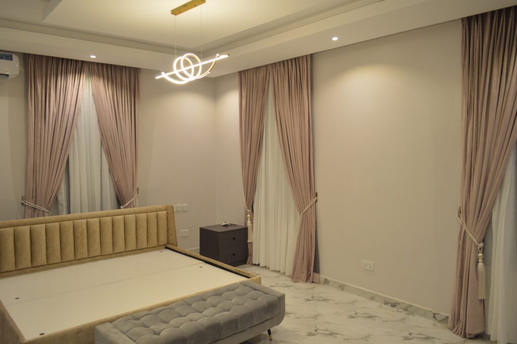
Grey Walls
Grey remains one of the most popular wall colors in modern homes.
Best curtain options include:
- Mustard yellow
- Navy blue
- Silver grey
- Cream
- Dusty pink
These combinations add warmth and personality.
Cream Walls
Cream walls create warmth and flexibility.
Ideal curtain choices include:
- Chocolate brown
- Gold
- Burgundy
- Olive green
- Beige
The result is timeless elegance.
Blue Walls
Blue walls naturally promote calmness.
Complement them with:
- White curtains
- Light grey curtains
- Beige curtains
- Navy curtains
These combinations maintain a serene atmosphere.
Common Mistakes Homeowners Make
Matching Everything Exactly
Many people believe curtains must be identical to wall colors.
This often makes rooms look flat and uninspiring.
Instead, use shades that complement rather than duplicate.
Ignoring Undertones
A beige wall may contain yellow undertones.
Another beige wall may contain pink undertones.
The difference matters.
Always compare curtain samples against wall paint before making a final choice.
Following Trends Blindly
What works on social media may not work in your home.
Room size, lighting, furniture, and architecture all affect outcomes.
Choose combinations that suit your space rather than temporary trends.
The Secret Interior Designers Rarely Mention
The most beautiful rooms are not created through expensive purchases.
They are created through thoughtful coordination.
A carefully selected curtain can make affordable furniture look premium.
A poorly selected curtain can make expensive furniture look cheap.
This is why curtain selection deserves as much attention as wall paint.
The magic is not in spending more.
The magic is in choosing wisely.
When Custom Curtains Become the Better Option
Ready-made curtains can work in certain situations.
However, they often force homeowners to compromise on color, size, fabric, and finish.
Custom curtains offer something different.
They are designed around your walls, windows, furniture, and lifestyle.
Instead of trying to fit your home into a pre-made solution, the solution is created specifically for your home.
That is where many homeowners discover the difference between simply decorating and truly designing a space.
Ceejay Interiors specializes in helping clients achieve this level of personalization through expertly crafted curtains, premium accessories, and professional installation services delivered across Nigeria.
Whether you’re designing a new home, renovating an existing space, or simply refreshing a room, choosing the right curtains can be the upgrade that changes everything.
Conclusion
Matching curtains with wall paint is both an art and a science.
The goal is not perfection. The goal is harmony.
Start by understanding the mood you want to create. Consider lighting. Think about texture. Use color intentionally. Most importantly, remember that curtains are not an afterthought.
They are one of the most powerful design elements in any room.
The next time you look at your walls, don’t ask, “What curtains should I buy?”
Ask, “What story do I want this room to tell?”
When your curtains and walls tell the same story, beautiful interiors happen naturally.
And if you’re unsure where to begin, the experts at Ceejay Interiors are always ready to help you transform your vision into a space that feels perfectly designed from wall to window.